
Responsive Web Design and SEO: Why Mobile-Friendly Sites Rank
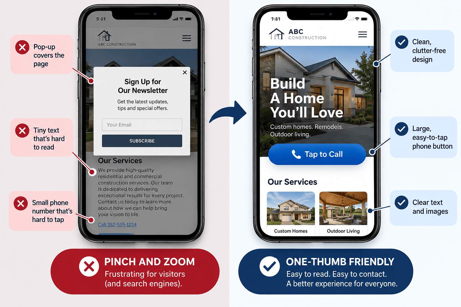
Pull up your website on your phone right now. Can you read it without pinching and zooming? Can you tap the phone number with your thumb? Does it load before you lose patience?
Those questions matter to search engines. When Google decides how to rank your site, it looks at the mobile version of your pages first. If your site struggles on a phone, that’s the version Google is judging.
Here’s how responsive web design connects to SEO, what Google says about it, and what to fix first if your website isn’t performing the way it should.
What Is Responsive Web Design?
Responsive web design means your website uses the same pages and the same code on every device, but the layout adjusts to fit the screen.
On a desktop you might see three columns. On a phone, those columns stack into one, the menu collapses, and buttons get big enough to tap.
Google describes three ways to build a mobile-friendly site:
- Responsive design: same URL, same HTML, layout adapts to screen size
- Dynamic serving: same URL, but the server sends different HTML depending on the device
- Separate URLs: a different mobile site, often on an “m.” subdomain
Google recommends responsive design because it is the easiest pattern to implement and maintain. That’s important for SEO, because the other two approaches create more ways for the mobile and desktop versions to drift apart.
Mobile-First Indexing: Where Things Stand in 2026
Google uses the mobile version of a site’s content, crawled with its smartphone crawler, for indexing and ranking. This is called mobile-first indexing.
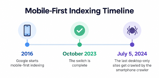
Here is the short history:
- 2016: Google started mobile-first crawling and indexing.
- October 2023: Google announced the move to mobile-first indexing was complete.
- July 5, 2024: Google said it would crawl the last remaining desktop-only sites with its smartphone crawler. If a site’s content isn’t accessible at all on a mobile device, it is no longer indexable.
Two clarifications also prevent a lot of confusion here:
Mobile-first indexing is not the same as mobile-friendliness. A clunky, desktop-style site can still be indexed if it loads on a phone. Google’s John Mueller has said directly that a site can be mobile-unfriendly and still be indexed.
What isn’t on your mobile pages basically doesn’t exist to Google. If your mobile version hides content, drops images, or skips structured data that your desktop version has, Google works from the thinner mobile version.
This is where responsive design earns its keep. Because it serves the same HTML everywhere, your content, headings, title tags, meta descriptions, and structured data match on every device automatically.
Core Web Vitals: The Speed and Stability Scores Google Uses
Core Web Vitals are three metrics that measure real-world user experience. Google says they are used by its ranking systems.
| Metric | What it measures | “Good” target |
|---|---|---|
| Largest Contentful Paint (LCP) | Loading: how fast the main content appears | Within 2.5 seconds |
| Interaction to Next Paint (INP) | Responsiveness: how quickly the page reacts to taps and clicks | Under 200 milliseconds |
| Cumulative Layout Shift (CLS) | Visual stability: how much the page jumps around while loading | Under 0.1 |
A few things worth knowing:
- INP replaced First Input Delay (FID) on March 12, 2024. Any audit or plugin still grading you on FID is out of date.
- Scores come from actual visitors. Google recommends judging each metric at the 75th percentile of page loads, split by mobile and desktop. (Do at least 75% of page visits meet the recommended performance target?)
- Good scores are not a golden ticket. Google says good Core Web Vitals don’t guarantee top rankings, and chasing a perfect score purely for SEO “may not be the best use of your time.”
Responsive design helps, but it doesn’t guarantee good scores. A responsive site loaded with oversized images, heavy sliders, and a dozen tracking scripts can still be slow to load on a phone. Responsiveness is the layout. Performance is the engineering underneath it.
The Bigger Picture About Page Experience
Google says its core ranking systems look to reward content that provides a good page experience overall, and that there is no single “page experience signal.” Its self-assessment questions include:
- Do your pages have good Core Web Vitals?
- Are your pages served securely (HTTPS)?
- Does your content display well on mobile devices?
- Do you avoid excessive ads that get in the way of the main content?
- Do you avoid intrusive pop-ups and interstitials?
- Can visitors easily tell the main content apart from everything else?
Google is also clear about its priorities. It will always try to show the most relevant content, even if the page experience isn’t perfect. However, when several pages are equally useful, a better user experience can help one stand out. If you’re competing with a handful of similar companies, that tiebreaker can make the difference for your ranking.
So, Does Responsive Design Help You Rank?
Responsive design isn’t a ranking factor on its own, but it supports nearly everything that is:
- Google ranks the mobile version of your pages. Responsive design makes sure the mobile version is complete.
- One URL per page. No duplicate mobile and desktop URLs to manage, and no split signals between them.
- Fewer mobile-only errors. Google states that most of its mobile-first indexing advice applies to dynamic serving and separate mobile URLs, because with responsive design the content and metadata are already the same. Common problems on those setups include missing structured data, mobile pages blocked by robots.txt, and mobile pages that all redirect to the homepage.
- A better experience for people. Visitors who can read your content and tap your phone number are more likely to become customers. That’s the whole point of ranking in the first place.
How to Check Your Site (Free Tools)
Google retired its Mobile-Friendly Test tool and the Search Console Mobile Usability report starting December 1, 2023. If someone tells you to “run the Mobile-Friendly Test,” that advice is outdated. You can use these instead:
Google Search Console, Core Web Vitals report: real-user data for your pages, grouped by mobile and desktop.
PageSpeed Insights (pagespeed.web.dev): field data where available, plus lab diagnostics and fix suggestions.
Lighthouse in Chrome DevTools: lab audits for performance, accessibility, and best practices, including whether your pages have a proper viewport tag.
Search Console URL Inspection: see how Google’s crawler renders a specific page.
Your own phone: seriously. Try to call your business, fill out your form, and find your hours, using one thumb.
Responsive Design Checklist for Better SEO
- Include the viewport meta tag (width=device-width, initial-scale=1) so pages scale to the screen.
Keep content, headings, and structured data the same on mobile and desktop.
Use collapsible sections or tabs instead of deleting content on mobile.
Don’t hide primary content behind taps or swipes that Google won’t trigger.
Compress and properly size images, and reserve space for them so the layout doesn’t jump.
Make phone numbers tap-to-call and buttons easy to tap.
Avoid pop-ups that cover the main content on phones.
Serve every page over HTTPS.
- Trim unnecessary scripts and plugins that slow down interactions.
Why This Matters for Ocala and Central Florida Businesses
Think about how your customers find you. A homeowner whose AC quits in the middle of an Ocala summer isn’t sitting at a laptop. Neither is a visitor in town for an event at the World Equestrian Center looking for a place to eat, or a Villages resident searching for a nearby service provider from the passenger seat of a car.
Nationally, mobile devices account for about half of US web traffic, according to StatCounter’s September 2026 data. Your own numbers may look different.
For local service businesses, a mobile visit can mean someone is ready to call. And if your phone number is hard to tap or your page takes too long to load, that customer may simply call the next business on the list.
Frequently Asked Questions
Is responsive design a Google ranking factor?
Not by itself. Google ranks the mobile version of your pages and uses Core Web Vitals in its ranking systems. Responsive design makes it easier to do well on both, which is why Google recommends it.
What is mobile-first indexing?
It means Google uses the mobile version of your site’s content, crawled with its smartphone crawler, for indexing and ranking. Google announced the transition was complete in October 2023.
Will Google stop indexing my site if it isn’t mobile-friendly?
Not if it still loads on a phone. A site that isn’t accessible at all on mobile devices can’t be indexed. A site that’s just kind of awkward on mobile can still be indexed, but it gives up the user experience advantages.
Does Google still have a Mobile-Friendly Test?
No. Google retired the Mobile-Friendly Test and the Mobile Usability report in December 2023. Lighthouse, PageSpeed Insights, and Search Console’s Core Web Vitals report are the current options.
What are good Core Web Vitals scores?
Google’s targets are LCP within 2.5 seconds, INP under 200 milliseconds, and CLS under 0.1, measured on real visits.
Is a separate mobile site bad for SEO?
It’s not automatically bad, but it is harder to maintain. You have to keep content, metadata, structured data, and redirects in sync across two versions. Google recommends responsive design as the simpler option.
Want a Site That Works on Every Screen?
If your website feels clunky on a phone, it’s probably costing you calls.
Dillon Media Group builds responsive websites for Ocala and Central Florida businesses, with SEO considered from the start.
Still not sure where your site stands? Reach out to our team and we’ll take a look.
Sources
Google Search Central, Mobile site and mobile-first indexing best practices (https://developers.google.com/search/docs/crawling-indexing/mobile/mobile-sites-mobile-first-indexing) (Dec. 10, 2025).
Google Search Central Blog, Mobile-first indexing has landed (https://developers.google.com/search/blog/2023/10/mobile-first-is-here) (Oct. 31, 2023).
Google Search Central Blog, Mobile-indexing-vLast-final-final.doc (https://developers.google.com/search/blog/2024/06/mobile-indexing-vlast-final-final.doc) (June 3, 2024).
Search Engine Roundtable, Google Will Still Index Sites That Are Not Mobile-Friendly After July 5th (https://www.seroundtable.com/google-will-index-not-mobile-friendly-sites-37516.html) (June 6, 2024).
Google Search Central, Understanding Core Web Vitals and Google search results (https://developers.google.com/search/docs/appearance/core-web-vitals) (Dec. 10, 2025).
web.dev, Web Vitals (https://web.dev/articles/vitals) (May 4, 2020; page updated Oct. 31, 2024).
web.dev, Interaction to Next Paint is officially a Core Web Vital (https://web.dev/blog/inp-cwv-launch) (Mar. 12, 2024).
Google Search Central, Understanding page experience in Google Search results (https://developers.google.com/search/docs/appearance/page-experience) (Sept. 22, 2026).
Google Search Central Blog, The role of page experience in creating helpful content (https://developers.google.com/search/blog/2023/04/page-experience-in-search) (Apr. 19, 2023; page updated Mar. 12, 2024).
Google Search Central, Avoid intrusive interstitials and dialogs (https://developers.google.com/search/docs/appearance/avoid-intrusive-interstitials) (Dec. 10, 2025).
web.dev, Responsive web design basics (https://web.dev/articles/responsive-web-design-basics) (Feb. 12, 2019).
Chrome for Developers, Lighthouse overview (https://developer.chrome.com/docs/lighthouse/overview) (June 2, 2025).
PageSpeed Insights (https://pagespeed.web.dev/).
StatCounter, Desktop vs Mobile vs Tablet Market Share United States (https://gs.statcounter.com/platform-market-share/desktop-mobile-tablet/united-states-of-america) (Sept. 2026).
Search Engine Journal, Top 7 SEO Benefits of Responsive Web Design (https://www.searchenginejournal.com/seo-responsive-web-design-benefits/211264/) (Feb. 7, 2022).